Third Pole Creamery had the product.
Real fruits.
No unnecessary preservatives.
Thoughtful ingredients.
A science-backed approach to quality.
But as the brand prepared to scale across India and enter the US market, one challenge became
obvious:
People trust what they understand.
And “scientific premium ice cream” can easily start sounding intimidating instead of
inviting.
The brand needed to feel:
- Credible without becoming clinical
- Premium without becoming cold
- Intelligent without losing warmth
Most importantly, it needed an identity people could instantly remember.
So We Asked a Simple Question:
What If Science Had a Mascot?
WTX India transformed Third Pole Creamery into:
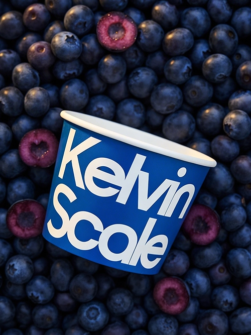
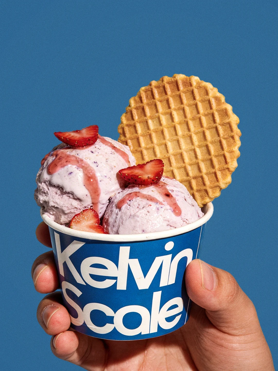
Kelvin Scale Creamery.
A name inspired by Absolute Zero — 0 Kelvin.
Not just scientifically relevant, but philosophically perfect for the product.
Absolute purity.
Absolute freshness.
Absolute ice cream.
The new positioning celebrated what made the brand different:
- Real fruits
- Cleaner ingredients
- No unnecessary additives
- Precision-driven craftsmanship
Science became the proof point.
But storytelling became the bridge.
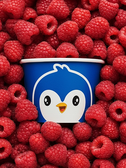
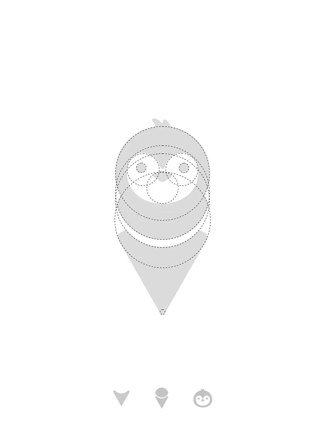
Enter the Penguin.
Cute Enough for Kids. Smart Enough for Trust.
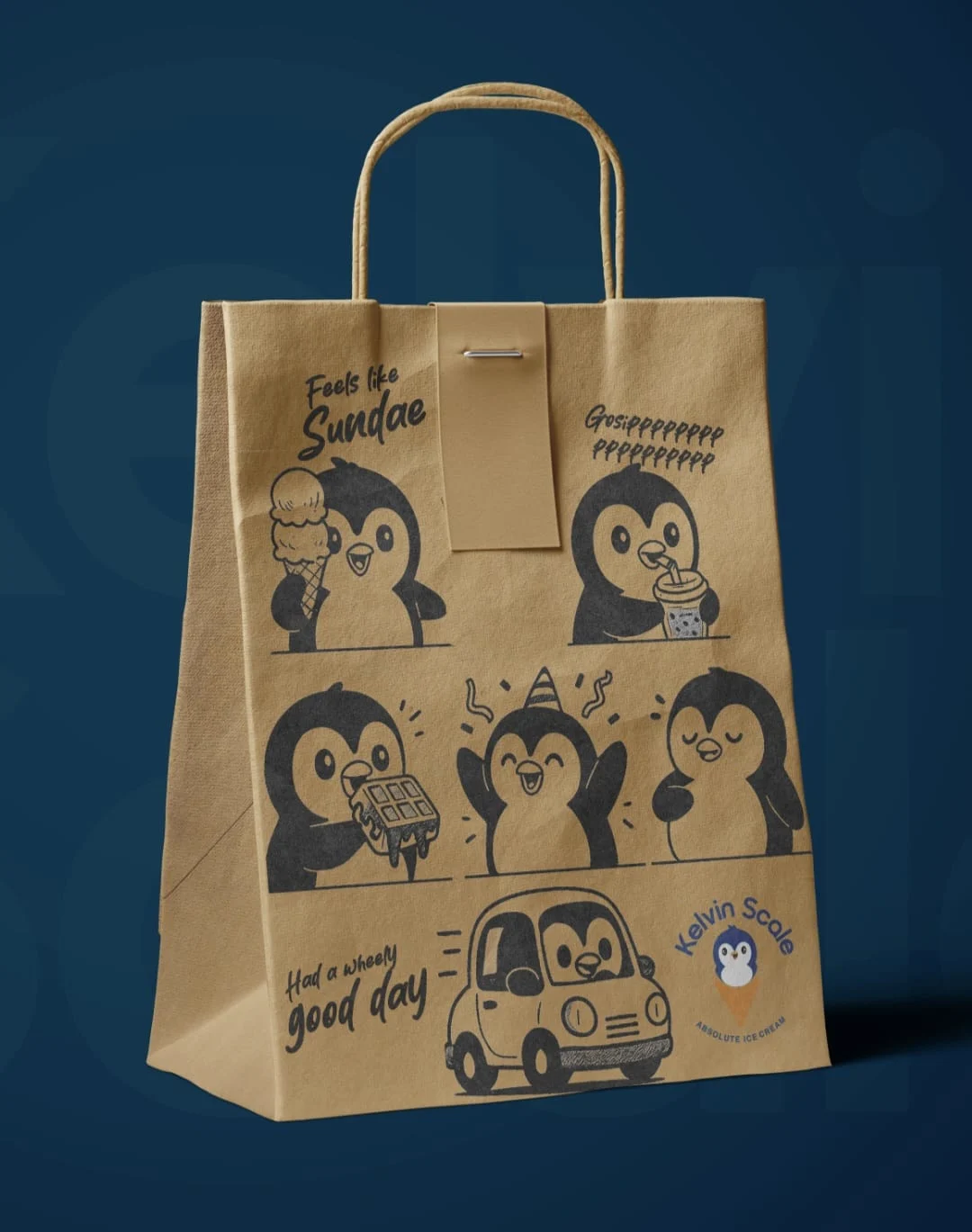
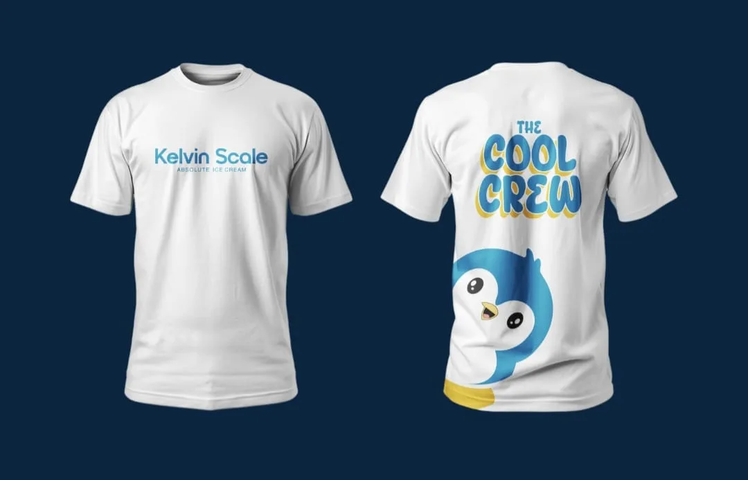
To make complex ideas approachable, WTX India introduced a penguin mascot
inspired by
the
world of temperature, ice, and precision.
The mascot became the face of the brand because it solved multiple problems at
once:
- Friendly and memorable for families
- Instantly ownable in crowded retail environments
- Visually scalable across packaging and social media
- Intelligent without feeling intimidating
The penguin made the brand feel human.
And suddenly, ingredient conversations no longer felt technical.
They felt fun.
One Brand. Two Markets. Different Conversations.
India: Simplicity Wins Hearts.
For Tier 2 and Tier 3 Indian audiences, communication focused on:
- Cuteness
- Recall value
- Simple language
- Real fruit storytelling
- Family-friendly warmth
The goal was trust through familiarity.
The mascot became an emotional shortcut that helped audiences instantly connect
with
the
product.
United States: Transparency Becomes Premium.
For the US market, the storytelling evolved.
Consumers cared deeply about:
- Ingredient sourcing
- Authenticity
- Scientific clarity
- Honest production methods
So the brand leaned into:
- Clean ingredient narratives
- Educational storytelling
- Transparency-first communication
- Scientific precision without jargon overload
The same mascot remained.
But the conversation matured.
The Branding Needed to Feel Cold. But Never Distant.
Identity System
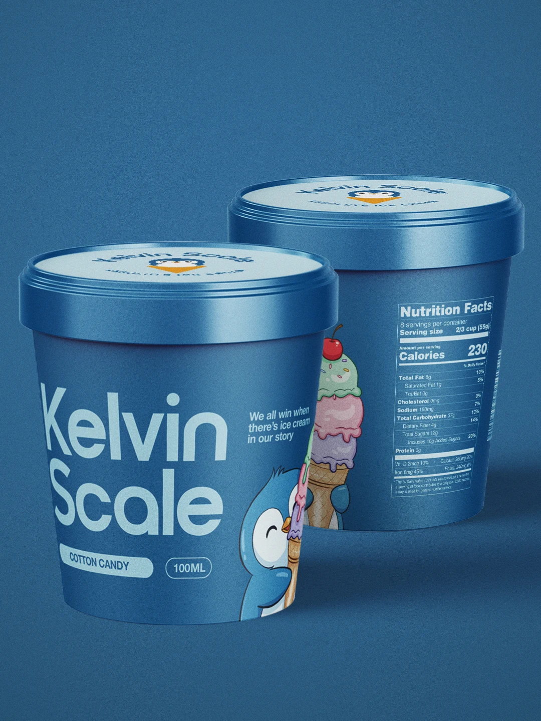
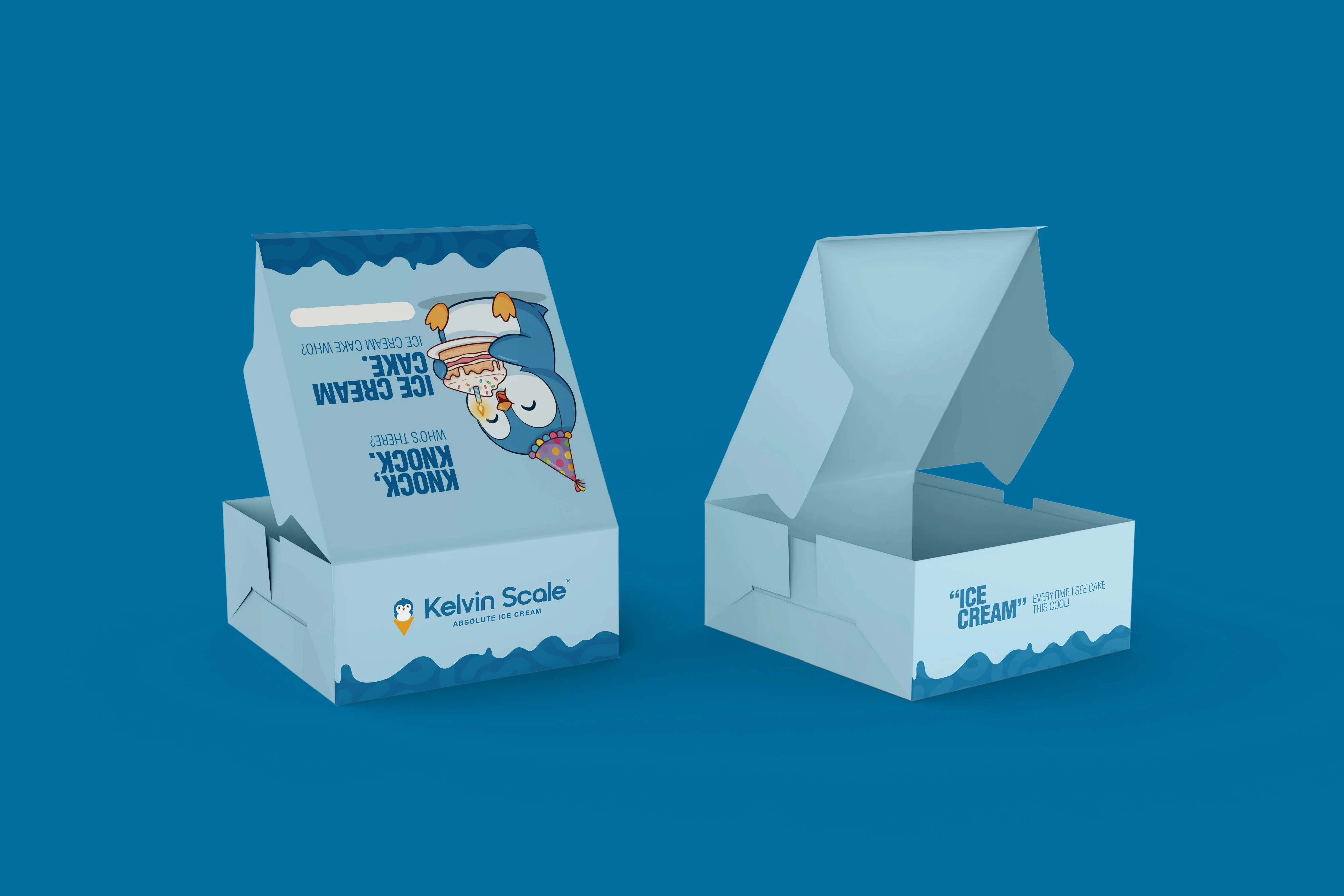
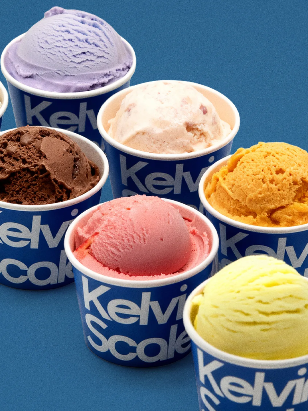
The rebrand extended across:
- Logo design
- Brand naming
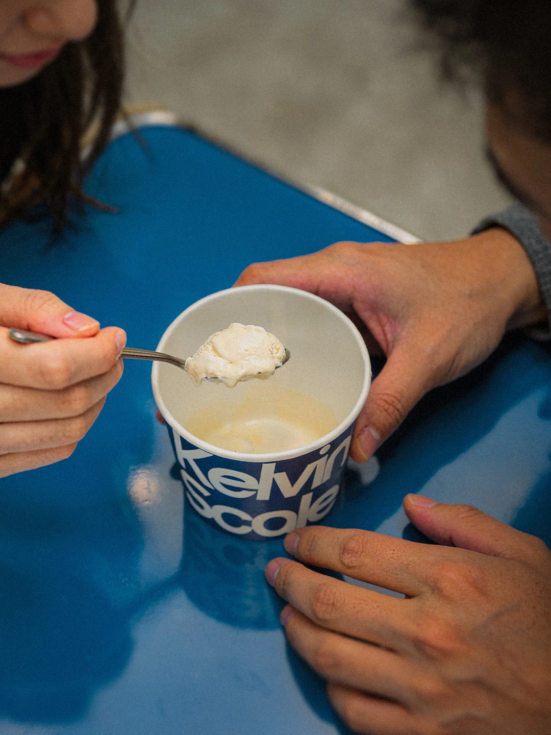
- Packaging language
- Mascot systems
- Tone of voice
- Tagline development
The phrase “Absolute Ice Cream” became central to the storytelling:
A nod to Absolute Zero.
And a promise of uncompromised quality.
Every design choice balanced playfulness with credibility.
Because the brand didn’t want to look like “another dessert company.”
It wanted to feel like the future of honest ice cream.